Property Inspector
The Property Inspector is the panel on the right side of the Layout Editor. When you select a component on the canvas or in the hierarchy, the Property Inspector shows all its configurable settings. If nothing is selected, it displays a prompt to select an element.
Top Section: Component Identity
At the very top of the inspector, you will always see two fields:
Component Type
A dropdown that shows (and lets you change) what kind of component this is. For example, you might switch a container from a div to a section, or change an input from text to number. Changing the component type preserves the component's position in the tree and its children.
Label / Content
The second field's purpose depends on the component type:
- For text elements (spans, paragraphs): This is the actual text content that appears on the sheet.
- For everything else: This is an editor-only label that helps you identify the component in the hierarchy. It does not appear on the exported sheet.
Give your components descriptive labels like "Strength Score" or "AC Container". These labels only appear in the editor, but they make navigating a complex sheet much easier.
Button-Specific Options
When a button is selected, you will see additional options:
- Show Die Icon: Toggle a die icon on the button. When enabled, you can choose which die to display (d20, d12, d10, d8, d6, or d4).
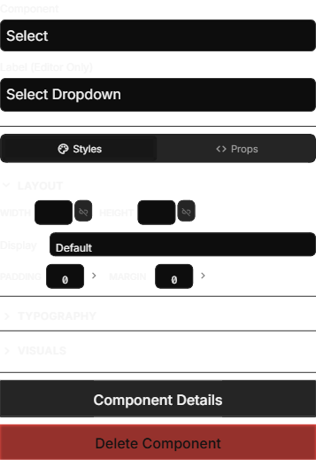
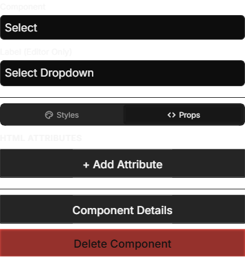
Inspector Tabs
Below the identity section, the inspector is organized into tabs:
Styles Tab
The Styles tab provides a visual interface for controlling how the selected component looks. You can set:
- Layout properties: Width, height, display mode, and alignment
- Spacing: Margins and padding
- Typography: Font size, weight, color, and alignment
- Background and borders: Colors, border radius, and border styles
You do not need to write any code here — the Styles tab provides dropdown menus, color pickers, and numeric inputs for everything. Changes are reflected on the canvas immediately.

The Styles tab also shows your sheet's Design Tokens so you can reference them directly. Using tokens instead of hard-coded values makes it easy to update your sheet's look and feel later.
Properties Tab
The Properties tab handles the functional configuration of your component — what it does, what data it connects to, and how it behaves when exported.
HTML Attributes
This section shows the raw attribute key-value pairs that will be included in the exported HTML. Common attributes include:
| Attribute | Purpose | Example |
|---|---|---|
| name | Connects the component to a character attribute | strength |
| type | The input type (for input elements) | text, number, checkbox |
| value | The default or current value | 10 |
| class | CSS class names for styling | sheet-ability-score |
| placeholder | Hint text shown when a field is empty | Enter character name |
The name attribute is the most important one for input fields. It tells the VTT which attribute on the character to store the value in. For example, an input with name set to strength stores its value in the attribute called strength. On Roll20, you can then reference this in roll macros as @{strength}.
For a deeper understanding of how Roll20 attributes work, see the Roll20 wiki on attributes.
When you add an input or button component, SheetArchitect prompts you to choose an attribute name. You can pick from attributes already defined in your sheet or type a new name to create one. The attribute name is then set as the name HTML attribute automatically.
Attribute Search
For the name attribute on input fields and buttons, the Property Inspector provides a searchable dropdown instead of a plain text field. This dropdown lists all attributes defined in your sheet, so you can quickly find and select the right one. You can also type a new name to create an attribute on the fly.
Grid Settings
When a Grid Container is selected, the Properties tab shows additional grid-specific controls:
- Min Column Width: Sets the minimum width of each grid column (e.g.,
200px). The grid automatically fits as many columns as possible at or above this width. - Gap: Controls the space between grid items (e.g.,
10px).
Adding and Removing Attributes
Click + Add Attribute to add a new key-value pair. This is useful for Roll20-specific attributes like data-i18n (for translation keys) or custom data attributes.
To remove an attribute, click the x button next to it.
Some attributes are required and cannot be removed. For example, input elements must keep their name attribute for the VTT to store the value correctly. The editor disables the remove button for these required attributes.
Designate as Attribute
For span elements that you want to display an attribute value (rather than static text), the Properties tab offers a Designate as Attribute button. Clicking it converts the span into an attribute-bound element, so it displays the live value of a character attribute instead of fixed text.
Advanced Tab
The Advanced tab provides a code editor where you can write custom CSS rules that apply specifically to the selected element. This is for advanced users who want fine-grained control beyond what the Styles tab offers.
Bottom Actions
At the bottom of the inspector, you will find action buttons:
- Component Details: Opens a detailed editor for components that have additional configuration (like select dropdown options or repeating section settings).
- Delete Component: Removes the selected component and all its children from the layout.