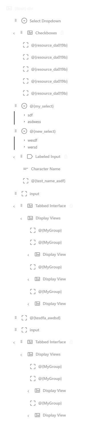
Element Hierarchy
The Element Hierarchy panel shows your entire sheet layout as a collapsible tree. Every component in your sheet appears here, indented to reflect how components are nested inside each other. It is the most precise way to understand and control your sheet's structure.
Navigating the Tree
The hierarchy tree mirrors the nesting structure of your sheet. At the top is the root container (your sheet itself), and everything else is nested inside it.
- Click a node to select it. This also highlights the corresponding element on the canvas and loads its settings into the Property Inspector.
- Click the arrow next to a container node to expand or collapse its children. This does not affect the sheet itself — it only controls what you see in the hierarchy panel.
- Icons next to each node indicate the component type (container, input, button, etc.), making it easy to scan the tree at a glance.
Selection is synchronized across all panels. If you click an element on the canvas, the hierarchy scrolls to and highlights the same node, and vice versa.
Expanding and Collapsing
Container components (divs, grids, sections, and other components that hold children) show a small arrow toggle. Click it to expand or collapse that branch of the tree.
When you are working on a large sheet with many nested sections, collapsing branches you are not actively editing helps keep the hierarchy manageable. The canvas is unaffected — collapsed branches are still fully visible and functional in the preview.
Rearranging Components
Drag nodes in the hierarchy to rearrange your layout. There are three types of moves:
Reorder Within a Container
Drag a node up or down among its siblings (other components at the same level inside the same container). A horizontal line indicator shows exactly where the component will be inserted. Release to drop it into that position.
Move to a Different Container
Drag a node over a container and hover for a moment. The container highlights to indicate it will accept the drop. Release to make the dragged component a child of that container.
Preview While Dragging
As you drag, the hierarchy shows a ghost preview of the component at its projected position. This makes it easy to see the result of a move before you commit to it. If the position does not look right, drag to a different spot or drop it back where it started.
Placement Restrictions
Not every component can go everywhere. The editor enforces certain rules:
- Only containers accept children. You cannot drop a component inside a text input, a checkbox, or other "leaf" components that do not have children.
- Repeating sections have specific requirements. Components inside a repeating section follow Roll20's naming conventions automatically.
- Locked components cannot be moved. Some prebuilt layouts lock their internal structure to prevent accidental changes. You can unlock them through the context menu if you need to modify them.
When a drop target is invalid, the hierarchy will not show a drop indicator for that location, and the drop will not be accepted.
Moving a component to a different container changes its position in the exported HTML. If you have logic or styles that depend on a component being inside a specific container, double-check those connections after rearranging.
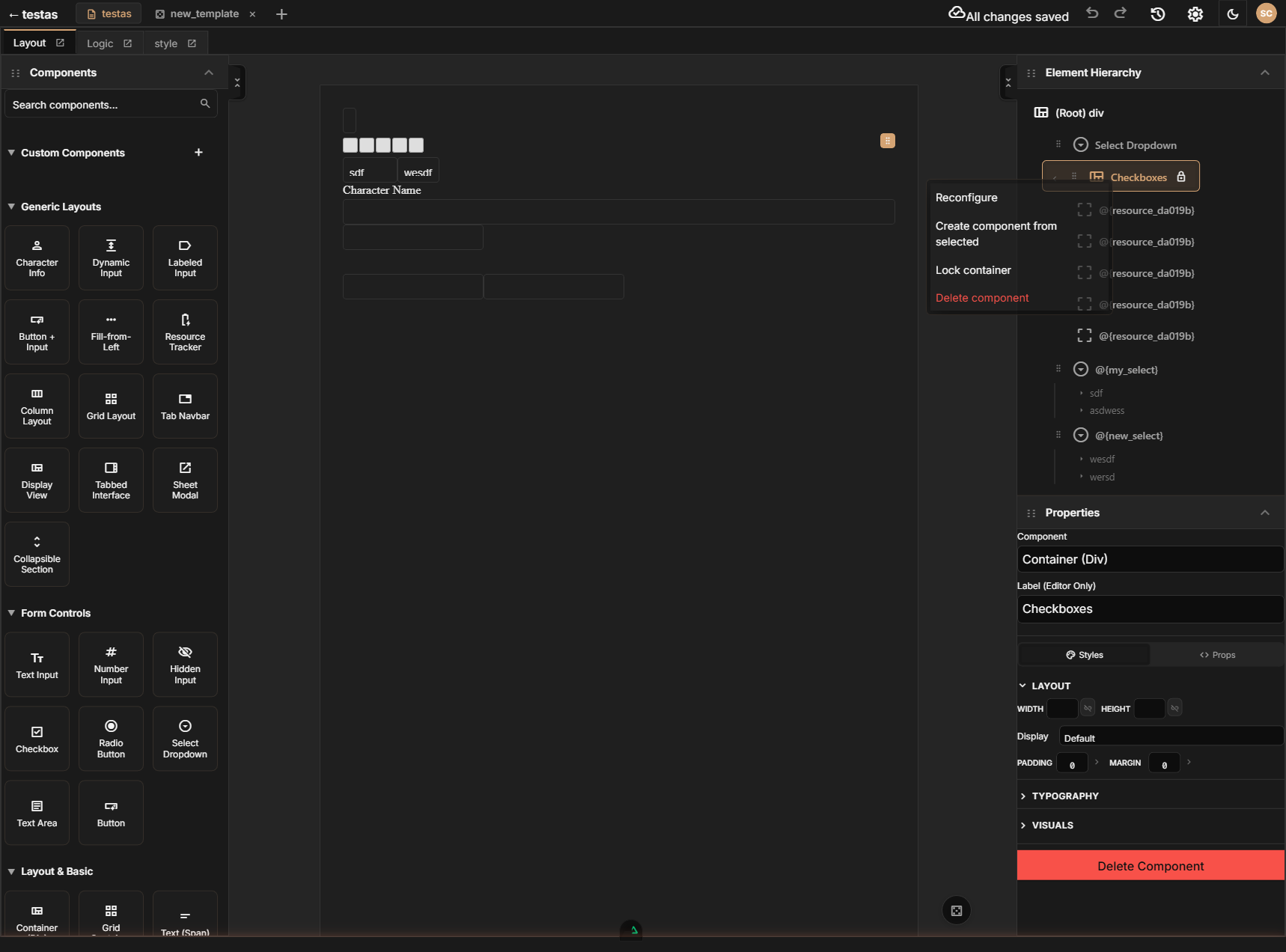
Right-Click Context Menu
Right-click any node in the hierarchy to open a context menu with quick actions. The available items depend on the component type and context:
| Action | What It Does | Availability |
|---|---|---|
| Add Child | Opens a searchable submenu of component types to add as a child of the selected container. For prebuilt layouts, this becomes a context-specific action (e.g. "Add Tab", "Add Column", "Add Cell", "Add Ability Score", "Add Skill") that only offers child types appropriate for that prebuilt. | Containers only |
| Reconfigure | Adjust settings on certain prebuilt layouts (e.g. change column count or tab names). | Some prebuilt layouts only |
| Create component from selected | Save the selected component tree as a reusable custom component that appears in your sidebar. | Not available on root or demo sheets |
| Component Details | View detailed configuration for the component, such as select options or textarea settings. | Inputs, selects, textareas, buttons, repeating containers |
| Lock container | Opens a submenu with locking options: Lock Dragging, Lock Dropping, Lock Selection, Lock All, or Inherit from parent. See Element Locking below. | Containers only |
| Delete component | Remove the component and all its children from the layout. | Not available on root |
Prebuilt layouts customize the Add action to only allow adding their specific child types. For example, a tab container will show "Add Tab" instead of the generic add menu, ensuring you only add valid children.
Element Locking
Element locking lets you protect parts of your layout from accidental changes. This is especially useful for prebuilt layouts, which use locks to guard their internal structure.
Lock Options
Right-click a container and choose Lock container to access these options:
| Option | What It Does |
|---|---|
| Lock Dragging | Prevents the component from being dragged to a new position in the hierarchy |
| Lock Dropping | Prevents other components from being dropped into this container |
| Lock Selection | Prevents the component from being selected by clicking on the canvas |
| Lock All | Enables all three locks at once |
| Inherit from parent | Removes any explicit lock on this component and inherits the lock state from its parent container |
Lock Indicators
Locked components display a lock icon in the hierarchy tree, making it easy to see which parts of your layout are protected.
Prebuilt Layouts and Locking
When you add a prebuilt layout (like an ability score block or tab container), its internal structure is automatically locked to prevent accidental modifications. You can still configure the prebuilt through its context menu actions (like "Add Tab" or "Reconfigure"), but you cannot drag its internal components around or drop arbitrary children into it.
If you need to modify a prebuilt layout's internal structure, you can unlock it through the context menu. Be aware that unlocking a prebuilt may allow changes that break its intended behavior.
Tips for Managing Large Trees
As your sheet grows, the hierarchy can get deep. Here are some strategies:
- Use descriptive labels. Rename containers to reflect their purpose (e.g., "Combat Section", "Spell Slots Row") so you can scan the tree quickly.
- Collapse finished sections. Once a section is working correctly, collapse it in the hierarchy so it is out of the way while you work on other parts.
- Use containers liberally. Grouping related fields into clearly labeled containers keeps the tree organized and makes rearranging entire sections easy — just drag the container.