Component Sidebar
The Component Sidebar is the panel on the left side of the Layout Editor. This is your toolbox — it contains every building block you can use to construct your character sheet.
Sidebar Sections
The sidebar organizes components into collapsible groups. Click a group header to expand or collapse it. The groups appear in the following order:
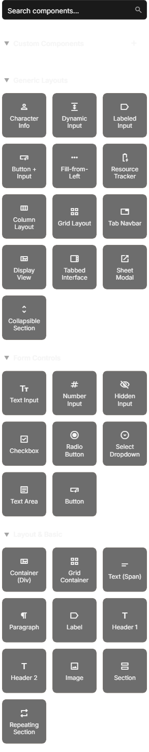
Custom Components
At the top of the sidebar, you will find your Custom Components section. These are reusable component patterns you have saved from your own sheet designs. You can drag them in just like any other component, and you can edit or delete them from here as well.
Custom Components require a signed-in account. If you are trying Sheet Architect without logging in, you are working on a temporary demo sheet stored in your browser's local storage. Demo sheets do not support custom components because there is no account to save them to. Sign in to unlock this feature.
Generic Layouts
System-agnostic prebuilt layout patterns like tab navigation, labeled inputs, and resource trackers. These are useful building blocks regardless of which game system you are targeting. For more detail, see the Prebuilt Layouts page.
System-Specific Layouts
Below Generic Layouts, you will see groups of prebuilt layouts organized by game system. The sidebar shows these groups based on the game systems you have enabled for your sheet. For example, if you enabled Dungeons & Dragons 5e, you will see a "D&D 5e Layouts" section with ability scores, skills, combat stats, and more. These are covered in detail on the Prebuilt Layouts page.
Form Controls
These are the interactive elements that players will fill in on your sheet. Each one maps to an attribute (a stored value on the character sheet).
| Component | What It Does |
|---|---|
| Text Input | A single-line text field — good for names, titles, and short text |
| Number Input | A field that only accepts numbers — ideal for scores, levels, and bonuses |
| Hidden Input | An invisible field that stores data behind the scenes — useful for calculated values |
| Checkbox | A toggle that is either on or off — great for proficiencies, death saves, and inspiration |
| Radio Button | A single-choice option — use a group of these when the player picks one option from several |
| Select Dropdown | A dropdown menu with predefined options — perfect for alignment, size, class selection |
| Text Area | A multi-line text field — use for backstories, notes, and spell descriptions |
| Button | A clickable button that can trigger dice rolls or actions when exported |
When you add a Form Control, SheetArchitect will ask you to name the attribute it connects to. This name is how the VTT stores and retrieves the value. For example, a text input named character_name stores whatever the player types into the attribute called character_name.
Layout & Basic
These are structural components that organize and display content on your sheet. They do not store data themselves — they hold other components or display static content.
| Component | What It Does |
|---|---|
| Container (Div) | A generic box that groups other components together — the most common structural element |
| Grid Container | A container that arranges its children in a grid layout — good for ability score blocks and stat grids |
| Text (Span) | An inline text element — for labels, static text, or attribute-bound display values |
| Paragraph | A block of text — for longer static content like instructions or descriptions |
| Label | A form label — can hold other elements inside it (useful for connecting labels to inputs) |
| Header 1 | A large section heading |
| Header 2 | A medium section heading |
| Image | Displays an image from a URL |
| Section | A semantic container — works like a div but signals a distinct section of your sheet |
| Repeating Section | A special container for dynamic lists — inventory items, spells, attacks, and so on. Add calculations with a Batch Processor in repeating mode |
Searching for Components
The search bar at the top of the sidebar filters components across all categories. Type a keyword like "checkbox" or "skill" and the sidebar instantly narrows down to matching results.
Search is particularly useful when you know what you want but cannot remember which category it is in. Searching for "button" will show you both the basic Button component and any prebuilt layouts that contain buttons.
Two Ways to Add Components
Drag and Drop
Click and hold a component in the sidebar, then drag it onto the canvas or into the Element Hierarchy tree. As you drag, drop indicators appear to show you exactly where the component will be placed.
- Dragging to the canvas: Hover over the area where you want the component. The canvas highlights valid drop targets.
- Dragging to the hierarchy: Hover over a container in the tree. A line indicator shows where in the list the component will land.
Release the mouse button to drop the component into place.
Click to Add
If you have already selected a component on the canvas or in the hierarchy:
- Click a component in the sidebar (instead of dragging).
- The new component is inserted as a child of whatever is currently selected.
This is handy when you are quickly populating a container with multiple fields — select the container once, then click each component you want to add.
If the currently selected element is not a container (for example, you have a text input selected), click-to-add inserts the new component as a sibling after the selected element, inside the same parent container.
Not all components can accept children. For example, you cannot drop a text input inside another text input. If you try to drop a component somewhere it does not belong, the editor will not allow it and will not show a drop indicator for that location.